|
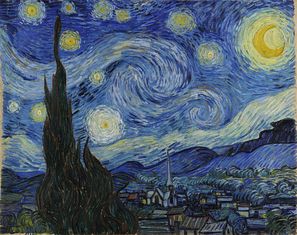
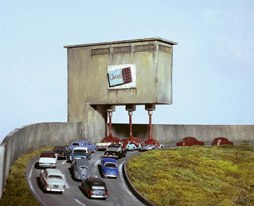
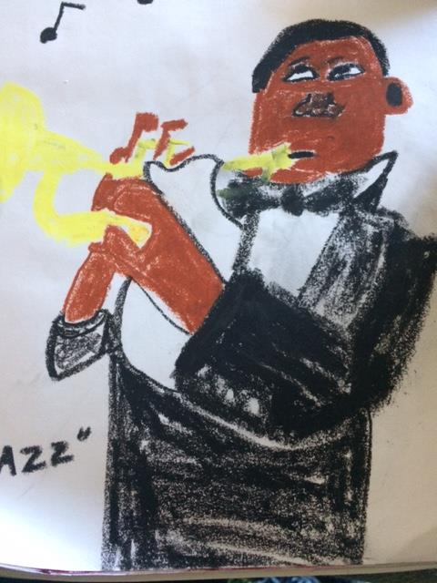
Art criticism process: 1. I need to describe what I see in art. 2. I need to analyze the art with its elements. 3. I need to interpret the art, explaining feelings. 4. I need to judge the art and see if it's successful to me and use evidence to support this. 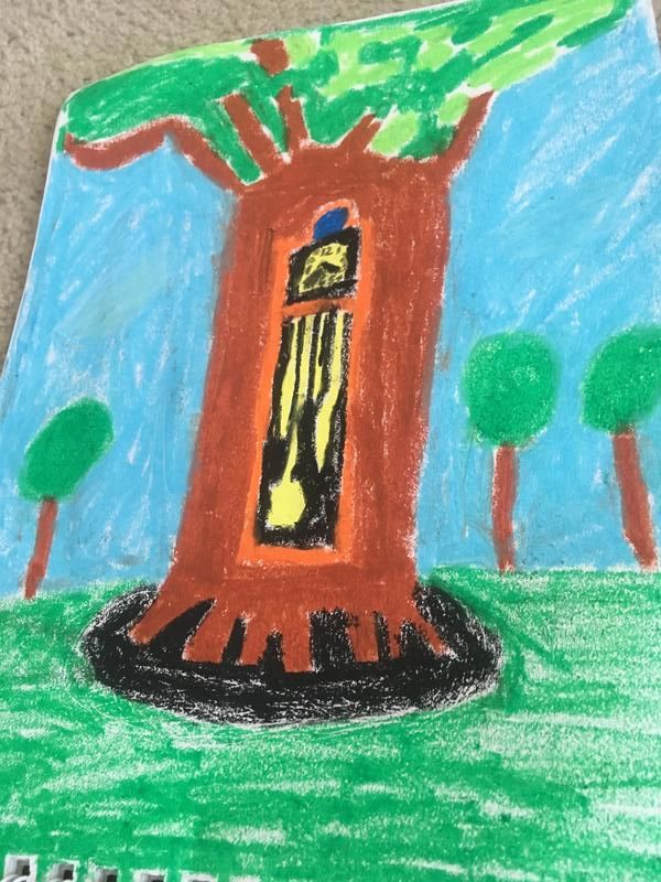 I'm critiquing my Two In One project. I decided in my brainstorming phase to use a tree and grandfather clock because I like clocks. My pencil sketch was how I pictured my final product precisely (see below). However, my final product was a little child like. Describe - In my piece, I see bright colors green, brown, orange, black, blue, and white. I see a somewhat 3D orange clock inside a large brown tree surrounded by blue sky with white clouds and other smaller trees on green grass. The piece is a bit distorted and magical. I am drawn to it wondering what it is all about. Analyze - The clock tree slightly pops out at me. So proportionally, it is bigger than the rest of the piece. I emphasized the clock tree and shadow. I used oil pastels for the final product which made the lines of the piece not as smooth and clear as I expected and gives it a weirder shape. The whole piece looks more like Salvador Dali and his surreal paintings (https://www.dalipaintings.com/images/paintings/the-persistence-of-memory.jpg). Interpret - This piece puts me a good mood because of the clock tree. It is a very unusual thing to see. This piece is outside in some far away magical forest land like a fairy tale. Maybe a troll, fairy or wizard would use a clock tree like this? Judge - Basically, in my planning stage, I had intended for the clock tree to be more detailed, especially with the pendulum and clockwork, the numbers and hands, and the leaves on the tree. Unfortunately, using oil pastels was not the best medium to make it more realistic. However, I do think that my image of a far away clock tree was successful because it does make me smile and the colors turned out bright. I think my art skills would've improved if I had used colored pencils. The texture of the oil pastels made it harder to make my straight lines and more detailed clockwork and leaves. 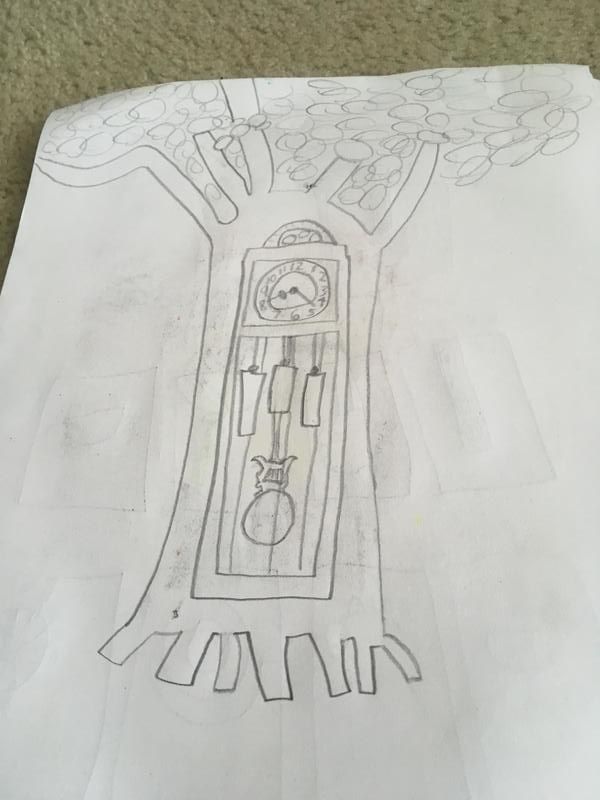 This was my expectation of what the Two In One project was supposed to look like. Question 15 - Most successful project My most successful project was my watercolor project, Squish the Bug in: "A Wonderful Morning." It was an idea that was originally thought up by my dad about a cartoon character called Squish the Bug. The theme of this piece is to always have a nice morning. It looks very old school like Mickey Mouse. I can use this character in other works. First, I did thumbnail sketches and then sketched the scene with pencil. Then, I filled it in with watercolor. The blue car in the background looks 3D and really good, and I'm proud of that. 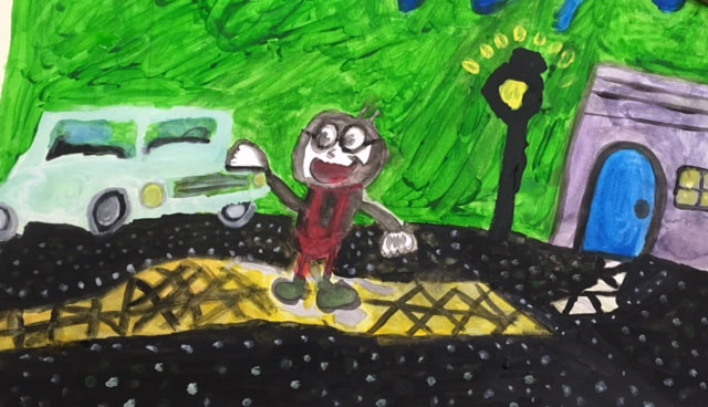 Question 17 - Most interesting sketchbook warm up My most interesting sketchbook warm up was the Upside-Down Picasso Man. I used pencil to draw this warm up. What I found interesting about this warm up was that I had to do it upside down. I feel like did a very good job drawing something by hand by sight, and it was upside down. The details of the picture are very precise. I was very surprised by how well I was able to draw it. The medium of pencil works very well for me when I draw. 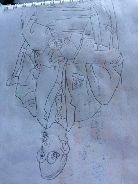 Question 18 - Most enjoyed medium to work with/medium I wished to work with in this class The medium I most enjoyed in this class was oil pastels because they were very colorful. These bright shades made my art look amazing. Oil pastels were useful to make things look 3D and pop off the page. The medium I didn't use and wished to work with in this class was photography. If I did art with photography, then I would be like Frank Kunert who made me laugh!
0 Comments
|
Ethan RenfroeClass of 2021 Archives
January 2018
Categories |
 RSS Feed
