|
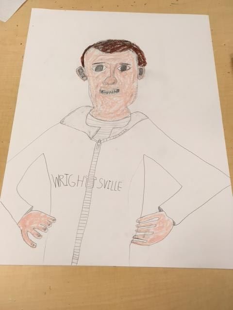
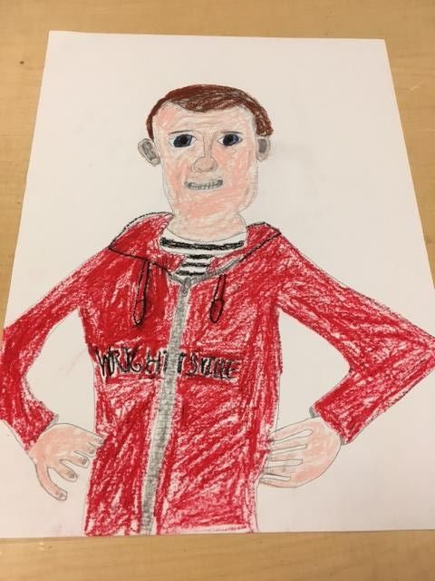
Art criticism process: 1. I need to describe what I see in art. 2. I need to analyze the art with its elements. 3. I need to interpret the art, explaining feelings. 4. I need to judge the art and see if it's successful to me and use evidence to support this. 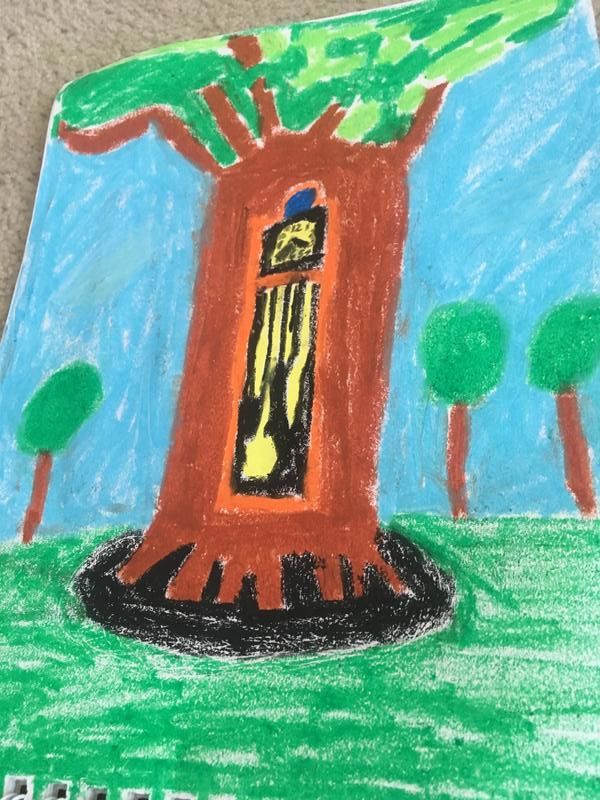 I'm critiquing my Two In One project. I decided in my brainstorming phase to use a tree and grandfather clock because I like clocks. My pencil sketch was how I pictured my final product precisely (see below). However, my final product was a little child like. Describe - In my piece, I see bright colors green, brown, orange, black, blue, and white. I see a somewhat 3D orange clock inside a large brown tree surrounded by blue sky with white clouds and other smaller trees on green grass. The piece is a bit distorted and magical. I am drawn to it wondering what it is all about. Analyze - The clock tree slightly pops out at me. So proportionally, it is bigger than the rest of the piece. I emphasized the clock tree and shadow. I used oil pastels for the final product which made the lines of the piece not as smooth and clear as I expected and gives it a weirder shape. The whole piece looks more like Salvador Dali and his surreal paintings (https://www.dalipaintings.com/images/paintings/the-persistence-of-memory.jpg). Interpret - This piece puts me a good mood because of the clock tree. It is a very unusual thing to see. This piece is outside in some far away magical forest land like a fairy tale. Maybe a troll, fairy or wizard would use a clock tree like this? Judge - Basically, in my planning stage, I had intended for the clock tree to be more detailed, especially with the pendulum and clockwork, the numbers and hands, and the leaves on the tree. Unfortunately, using oil pastels was not the best medium to make it more realistic. However, I do think that my image of a far away clock tree was successful because it does make me smile and the colors turned out bright. I think my art skills would've improved if I had used colored pencils. The texture of the oil pastels made it harder to make my straight lines and more detailed clockwork and leaves. 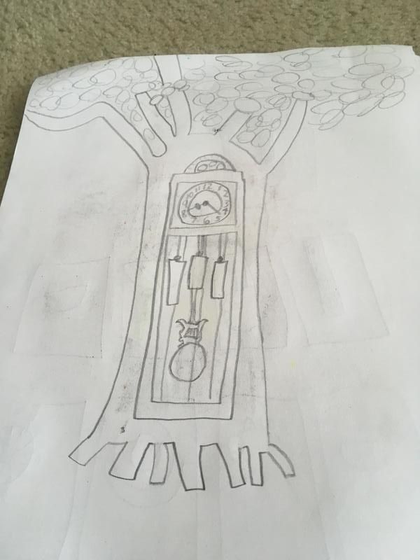 This was my expectation of what the Two In One project was supposed to look like. Question 15 - Most successful project My most successful project was my watercolor project, Squish the Bug in: "A Wonderful Morning." It was an idea that was originally thought up by my dad about a cartoon character called Squish the Bug. The theme of this piece is to always have a nice morning. It looks very old school like Mickey Mouse. I can use this character in other works. First, I did thumbnail sketches and then sketched the scene with pencil. Then, I filled it in with watercolor. The blue car in the background looks 3D and really good, and I'm proud of that. 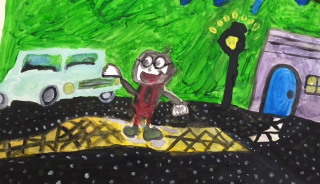 Question 17 - Most interesting sketchbook warm up My most interesting sketchbook warm up was the Upside-Down Picasso Man. I used pencil to draw this warm up. What I found interesting about this warm up was that I had to do it upside down. I feel like did a very good job drawing something by hand by sight, and it was upside down. The details of the picture are very precise. I was very surprised by how well I was able to draw it. The medium of pencil works very well for me when I draw. 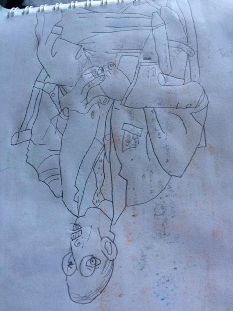 Question 18 - Most enjoyed medium to work with/medium I wished to work with in this class The medium I most enjoyed in this class was oil pastels because they were very colorful. These bright shades made my art look amazing. Oil pastels were useful to make things look 3D and pop off the page. The medium I didn't use and wished to work with in this class was photography. If I did art with photography, then I would be like Frank Kunert who made me laugh!
0 Comments
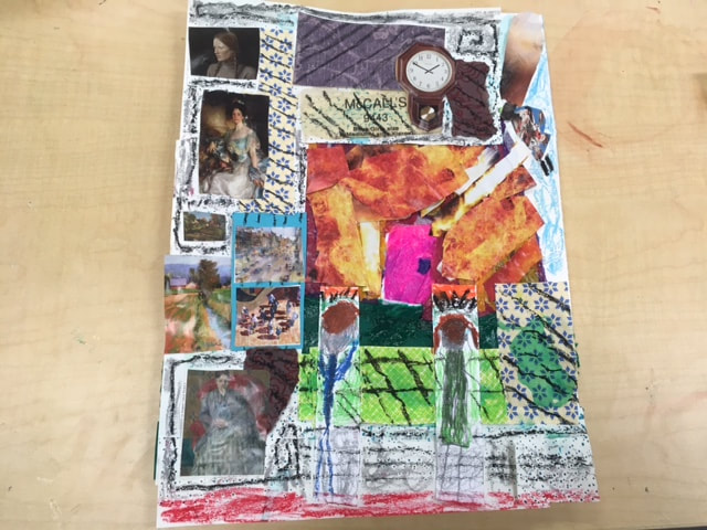 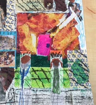 In this mixed media piece, I used 5 different mediums. The first thing I did was use tissue paper and glue to make grass and the door. Next, I used shelf paper and magazine cutouts to create the inside of the house. The shelf paper is the walls of the house and the paintings and clock are from magazines on the inside. On the outside, the fire and drone are also from magazines and layered on top of the tissue paper. The kids who are staring out the window are drawn with pencil and then I added oil pastels for color and texture.
My word was disaster. So in this picture, the kids are watching in horror as their neighbor's house is burned down by a drone. The view is from the inside of the house, but the perspective is weird because of the circumstances of the disaster. My piece reminds me of M.C. Escher's crazy art. 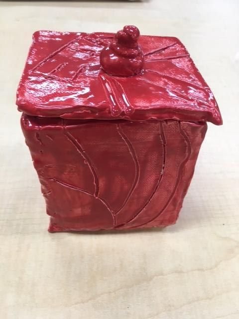 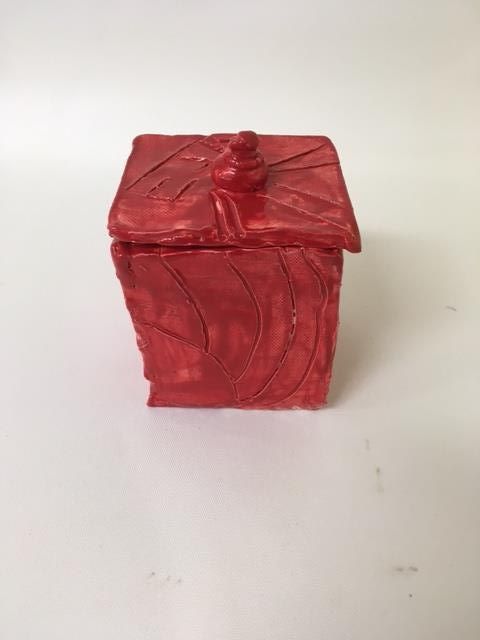 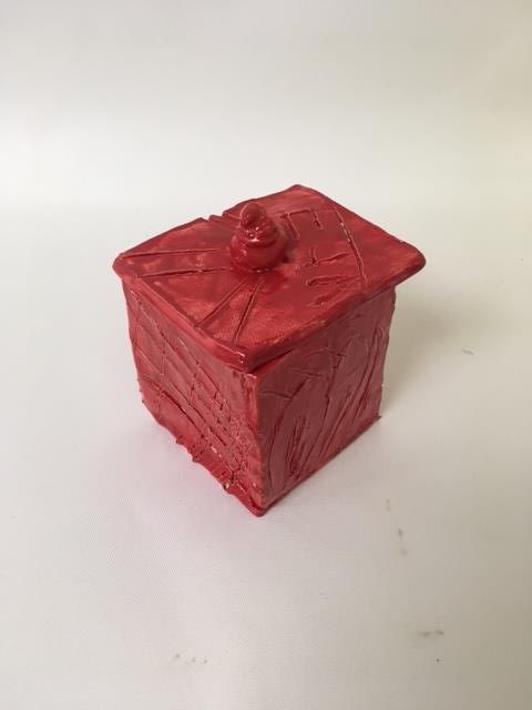 Since my in process blog, I painted my piece with glaze paint and sent it to fire it again.
I think the color turned out successful because it is so shiny. I can see the details very well. I think it looks very good, so there is nothing I would change about it. 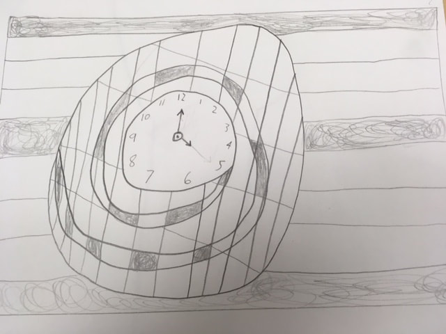 This is my sketch. 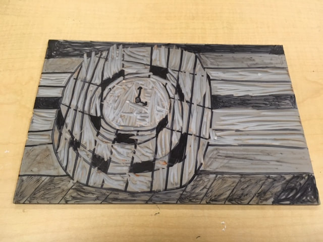 This is my linocut block. 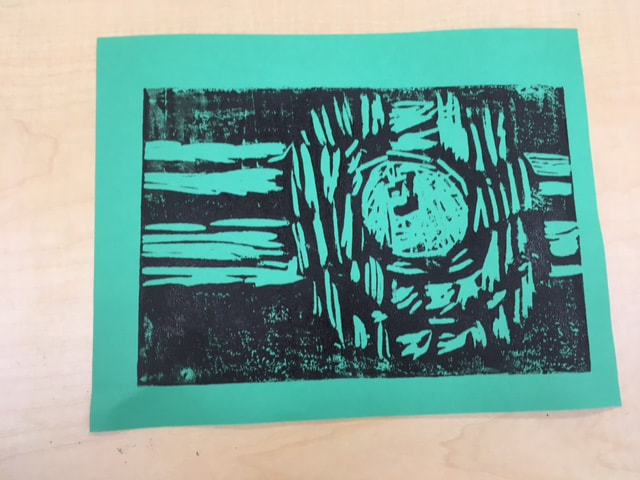 This is my best print. I used lines in different directions to show specific parts of my design. The horizontal lines are the wall. The vertical lines and the spiral lines show the shape of the clock.
I kind of like how the design came out. The print pretty much shows the details of what I expected. If I were to do it again, I would've flipped the block the other way when I printed it. I also wish I would've added numbers to the clock, but I was nervous that I couldn't do it right. Sadly, I ended up having a clock without numbers, but I think you can see that it is still a clock even though the hands are kind of blurry. I'll do better next time. 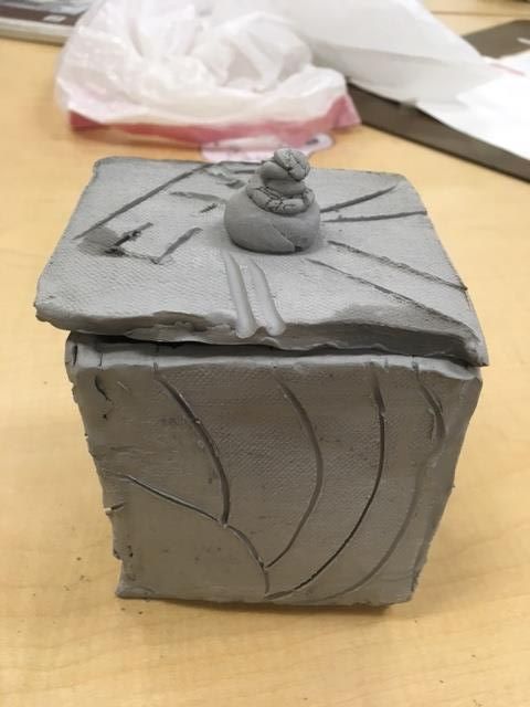 I made a clay box with a lid. When it is out of the kiln, I will paint it bright colors. I am going to use this for storing supplies (like pencils) inside. I found mostly everything difficult. When merging the sides of the box, I was afraid they were going to break. I had extra clay at the end, so I made a lid topper, which was successful.
I started with a slab of clay for construction of my box. Using a cutting tool, I cut the slab into six pieces. I put together four sides of the box using sprayed water. I put the four merged pieces onto the fifth (bottom) piece. Finally, I used the sixth piece to make the lid, adding the extra piece of clay on top for a lid topper. I used another cutting tool to decorate the whole box. I think my decorations were successful. My greenware is currently being fired in the kiln. I can't wait to see what it looks like when it comes out! When I'm done painting, it is going to look AWESOME! 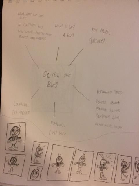 This was the mind map for the project.  This is the most helpful warm up. 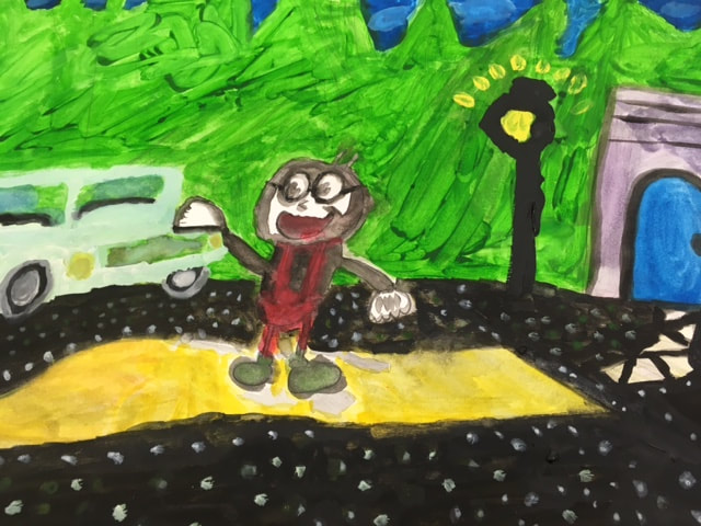 This is the WIP of the painting.  This is the final piece. This is Squish the Bug. He is a character that my dad once came up with and I liked it.
Other designers used recognizable animation while I created my own. I drew out the sketch, then started to use the watercolor on Squish himself. Then I did the scenery. The watercolor was a bit leaky, so take your time when working with this medium. 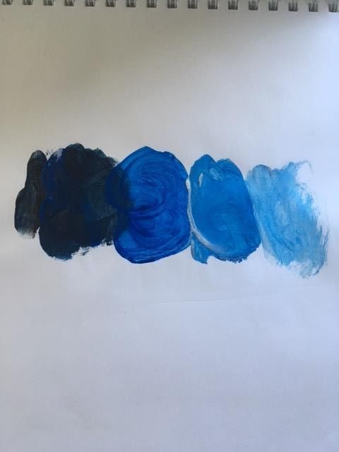 The hue value scale. 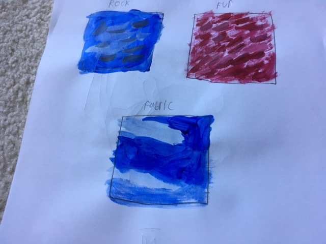 The most helpful warm up was the textures with paint. 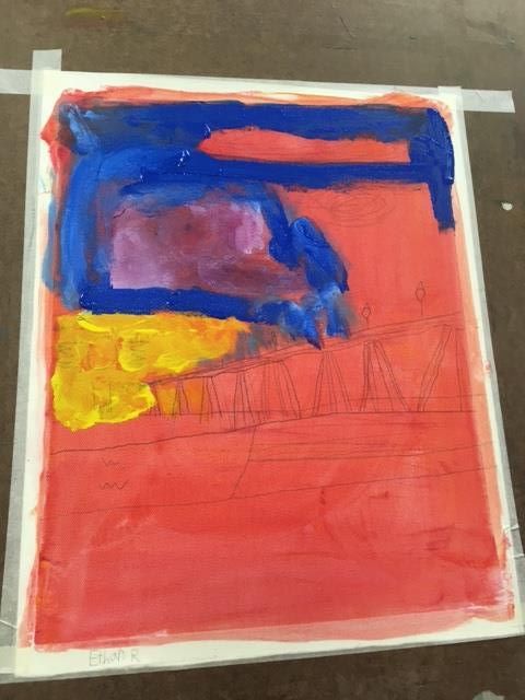 The W.I.P (work in progress) of my painting. 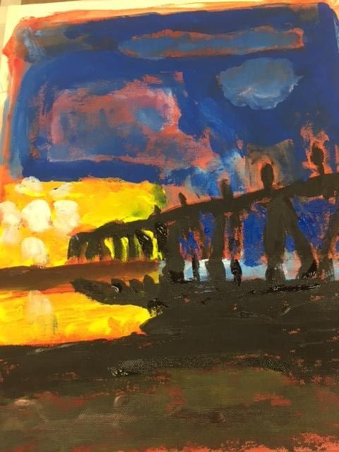 The final piece, "The Pier at Early Dawn." The piece represented is the pier at Wrightsville Beach. It is important to me because I absolutely love the ocean, and I would spend everyday there. What I found the most challenging was that the paint kept drying out every time I painted extensively with all of the painting parts. What I feel is most successful about the piece is the both the shadow of the pier and the lighting. I started out with a pencil sketch of the painting on red paint. Then I added a base of yellow and blue and used red and blue to make purple, then used white and purple to make light purple. I then painted the pier in black, which is a nice contrast to the other colors.
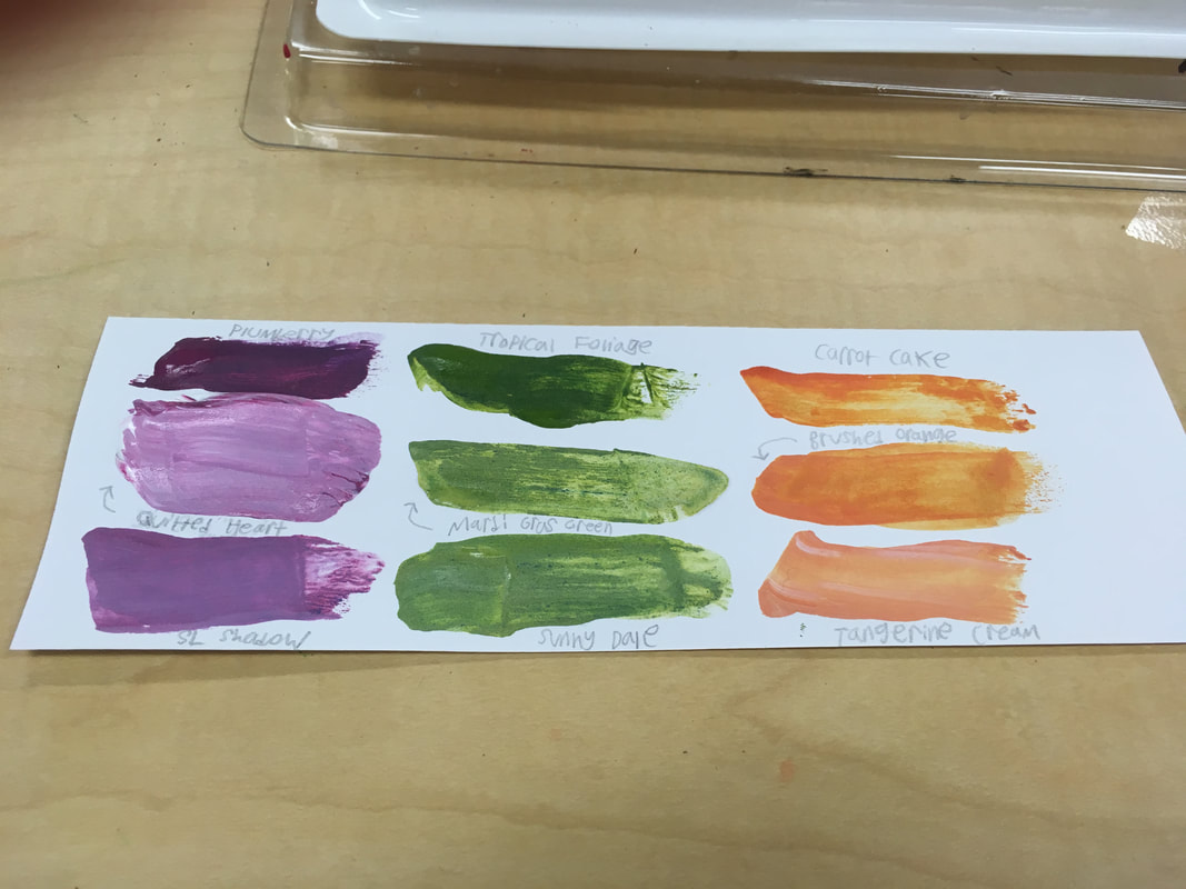 I learned to make purple by mixing red and blue. That was really cool! I also learned that there are a variety of different color choices in the same family, like Tangerine Cream and Carrot Cake. My favorite color family is green. 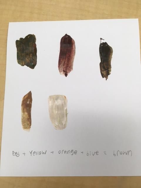 To make brown, you add red, yellow, orange, and blue.
My mentor's name is Lacey and she is a senior. The type of art she makes is prisma color pencil.
laceypeterson-Apex-2018.weebly.com She hopes to help me with things I don't know how to do. I want to learn to draw better. I hope she can help me! |
Ethan RenfroeClass of 2021 Archives
January 2018
Categories |
 RSS Feed
