1. Look at your body of work over the semester and choose 2 pieces that show your growth as an artist. Discuss each piece and how you grew in the following areas: application of materials, techniques and skills, artistic vision, use of the principles and elements, creativity, intuition and subject matter. DON'T FORGET TO ADD PHOTOS
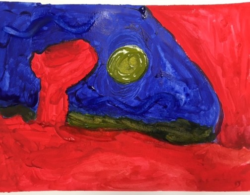
My watercolor painting, "The Moon Over The Red Rocks," in the style of Georgia O'Keeffe.
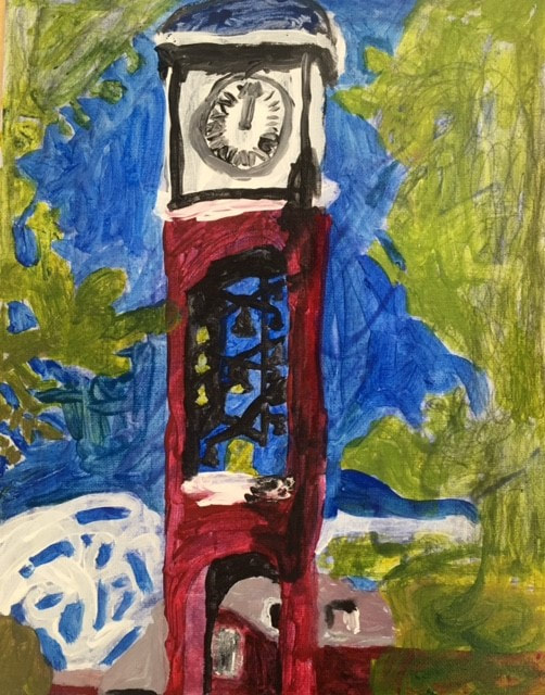
My acrylic painting, "UNCG Clock Tower," in the style of Horace Pippin.
This semester, I think I grew as an artist in painting. The water color unit allowed me to practice techniques such as wash, salt, wet on wet and contrasting both warm and cool colors. I enjoyed researching different water color artists like Vincent Van Gogh, John Marin and Georgia O'Keeffe. My final water color piece, "The Moon Over The Red Rocks," reflected the style of O'Keeffe. Water color painting was easier to do than the final acrylic piece because the acrylic piece required more accurate details. Water color allowed me to express myself in a more abstract way using beautiful bright colors. My piece using acrylic paint, "UNCG Clock Tower," was more difficult because the paint kept leaking. This made it harder to paint the specific details that popped out in Horace Pippin's work. I did grow as an artist because even though I had to paint in a more accurate way when in the style of Horace Pippin, I was able to do it with the acrylic paint with shadowing and got to use bright colors again. I think I still need more practice with acrylic paint, but I did enjoy the subject matter.
2. Look over the portfolios of other students in our class. Choose a piece of artwork from one of your classmates that you feel is an exemplary showcase of what the project was to depict. Discuss how the artist used the medium, utilized the elements of art and design principles, was original with their ideas and went beyond their comfort zone or the realm of the requirements. Make sure you have the image of their artwork along with their name (first name only) posted with this response. Also include a link to their portfolio. DON'T FORGET TO ADD PHOTOS
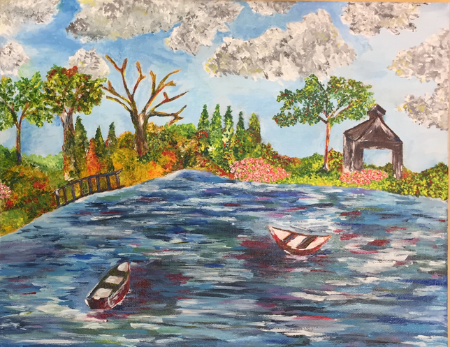
Ashley's painting in the style of Mary Cassatt. http://ashley-apex-2019.weebly.com/art-2.html
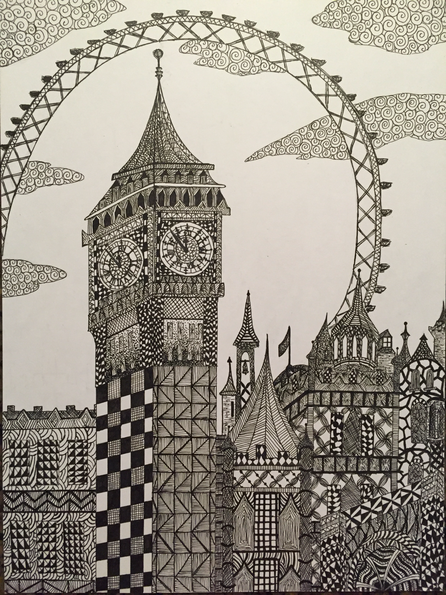
Ashley's pen and ink drawing of London.
Ashley did a fantastic job in two different projects. First, her painting in the style of Mary Cassatt was quite good. She created an amazing landscape with bright flower colors just like in Cassatt's paintings. Ashley's water reflected the details of Cassatt in the ripple effects with a variety of colors. There is a lot of texture in her piece just like in Cassatt's work. Also, Ashley did a fabulous job with the pen and ink unit. Her piece with London's Big Ben and the Eye have so much detail. Her techniques include hatching at the top of the towers, cross hatching all over the buildings, spirals in the clouds and other techniques she invented. I am very impressed with her work.
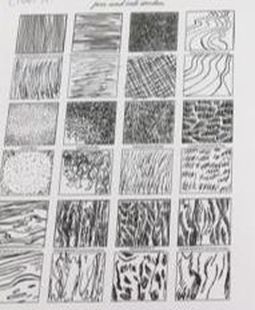
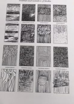
3. What medium was your favorite to work with? Explain why and how you were able to master the techniques associated with this medium. DON'T FORGET TO ADD PHOTOS
|
|
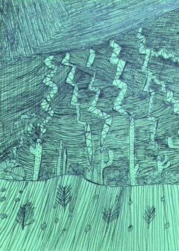
My favorite medium to work with was the pen and ink. I really enjoy drawing, and this project gave me the chance to work with some specific techniques. My favorite pen and ink techniques were hatching, cross hatching and invented. I found stippling to be hard on my hands. In my piece, Cacti Struck By Lightning, I used a variety of techniques that brought a 3D effect to my work. I tried hard to practice the techniques, but I am not sure that I have mastered them all. Contrast of texture and value were both more difficult to do. My hands got very tired using these pen and ink techniques. It takes a good artist to keep pen control.
4. Discuss one project where you felt you were the least successful. Explain why you felt this way. What would you do differently to change this piece? Explain . DON'T FORGET TO ADD PHOTOS
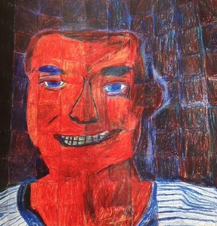
I believe my least successful piece was my self portrait. Although I nailed the drawing of my face, the blending of the colors did not go as well as I would have liked. My face is really red rather than skin toned. If I could start over again, I would have used more yellow and less red. I also blended the colors so my hair looks non existent which I wish I could have fixed. Despite the poor color blending of my face and neck, my shirt turned out pretty well. The squares were very helpful because they guided me in my self portrait. I would totally use that technique again.
