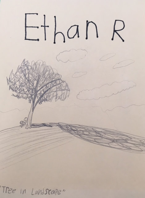
I drew this tree and landscape using pencil.
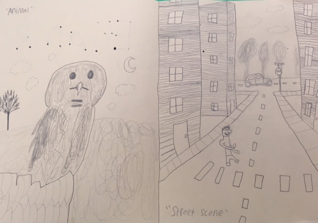
This owl drawing and street scene (with perspective) drawing were also drawn with pencil.
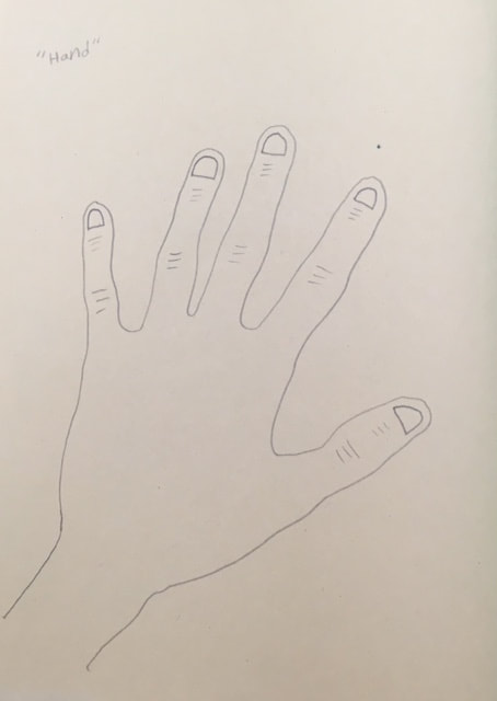
A close-up drawing of my hand done with pencil.
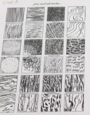
Pen and Ink Unit:
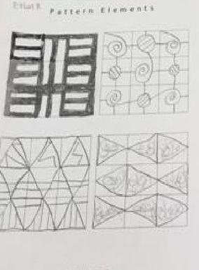
Here are the pen and ink techniques that I practiced in class:
Here are the pen and ink techniques that I practiced in class:
Here, I liked the crosshatching because it was easy to do. The wood textures were kind of cool too.
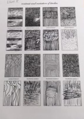
I like the line direction variation 2 technique the best because it's easy to draw with and makes a 3D pop. It is like an optical illusion for the eyes.
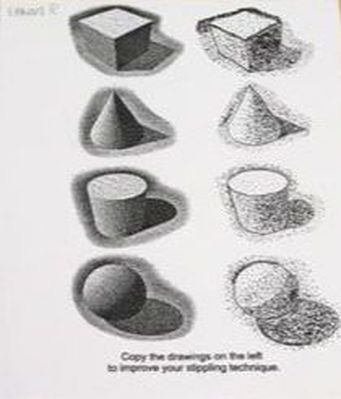
I found stippling to be very hard on my hands.
The paper roll pattern was my favorite here.
The one with the fans was my favorite here.
The spiral mixed with circles one is my favorite here.
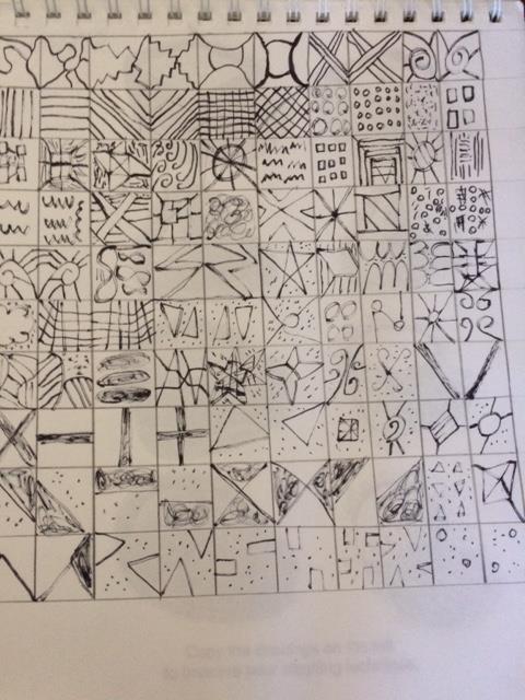
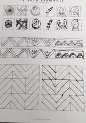
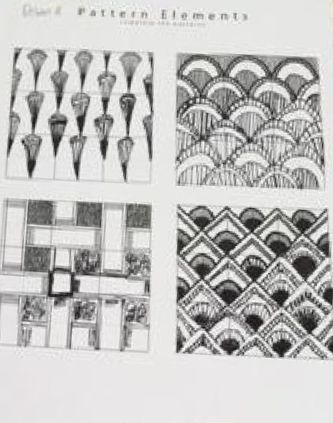
100 pen textures that I did in my sketchbook.
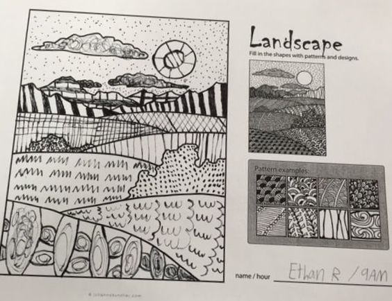
A landscape worksheet that I was supposed to add texture to with patterns and designs.
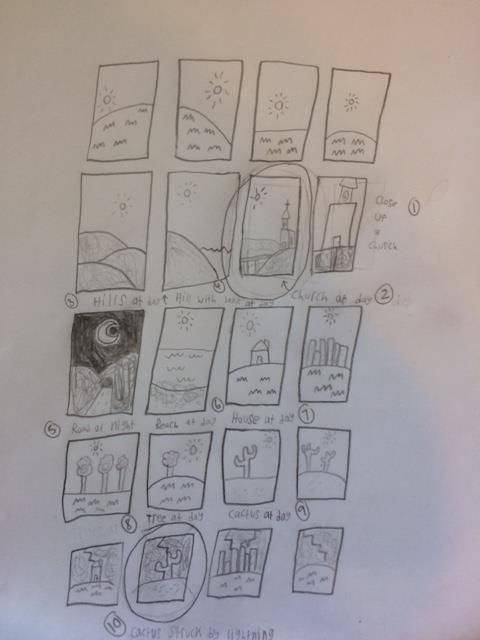
Pen and Ink Pattern Project Brainstorming
Thumbnail sketches for my project. I chose a cactus being struck by lightning.
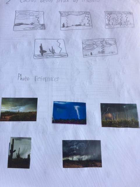
Sketches and brainstorming ideas for my cactus landscape.
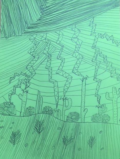
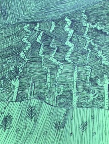
W.I.P. 1: I started with my pencil sketch of my landscape project. It's called "Cacti Struck by Lightning."
W.I.P. 2: Added texture to the storm cloud and lightning bolts.
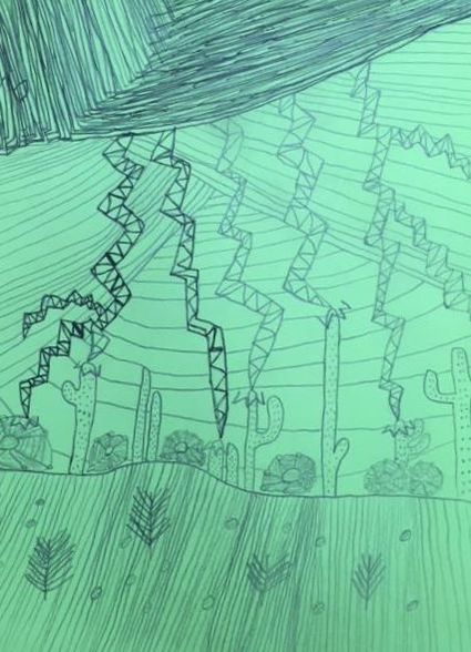
W.I.P. 3: More texture to the cacti and ground.
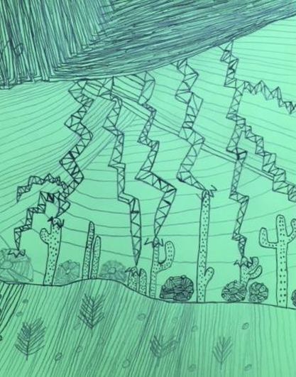
W.I.P. 4: The ground and shrubs being textured.
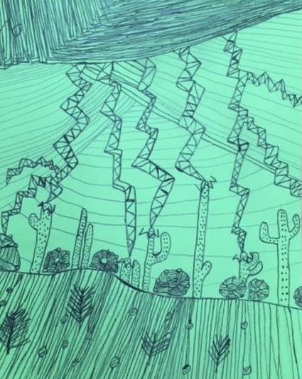
Final Artwork "Cacti Struck By Lightning"
Self Evaluation
1. Describe how you arranged your composition. Discuss your use of the elements and principles. Is it a successful composition?
My composition is a landscape with cacti being struck by lightning. I used hatching, cross hatching, parallel line strokes, continuous lines, stippling, and custom lightning texture. I used hatching, parallel line strokes, and cross hatching in the storm clouds to make it appear dark and ominous. I used custom texture in the lightning bolts to create a slight-3D effect. I used stippling for the cacti to make the dots resemble prickles. Finally, I used continuous lines to give texture to the ground. Yes. I think the arrangement is successful.
2. How are texture and pattern important in your composition?
I needed to use a lot of different textures and patterns with my pen to create a variety of images. My landscape is called "Cacti Struck By Lightning." The cacti and the lightning needed to stand out from the sky and the ground. I used various textures and patterns to draw attention to the different parts of my landscape and to the cacti being struck. Without textures and patterns, my landscape would be very boring.
3. Why is value so important in this project?
The dark and light contrast draws attention to the art. Without the contrast, my artwork wouldn't draw the viewer's attention and wouldn't be successful.
4. Describe your craftsmanship (How well the project is crafted technically)
I think I did a good job on the cacti and lightning bolts. I like the way the ground looks compared to the storm clouds. It is hard to see the smaller shrubs next to the cacti, however, it is during a storm.
5. Explain how your knowledge and creating practice studies with value and pattern contributed to the success of your piece.
The practice studies of value and pattern let me see which would work best for my landscape. I knew stippling would be great for the cactus and hatching/cross-hatching would work well for the dark sky. Also, the custom texture/pattern for my lightning bolt was my own creation which I learned about doing from my 100 texture boxes.
6. When applying the pen and ink/pattern techniques why and how is it important to make sure you understand the concepts taught in class?
Understanding the techniques allowed me to choose the right way to make the image the way I wanted it. Each technique let me create the look I wanted for each part of my landscape. Stippling in the sky wouldn't have created storm clouds and cross hatching on the cacti would've ruined the look.
7. As a growing artist how do you think what you have learned will guide and better your future projects.
These techniques with pen and ink will be a good reference for when I have a specific piece in mind. They let me create the effects I want when choosing drawings for the future.
8. If you could recreate your piece what would you do differently to enhance your final outcome? I think that a different color paper would've been a better choice to contrast the storm and landscape. I would have made the smaller shrubs stand out better with more value next to the cacti.
Watercolor Unit:
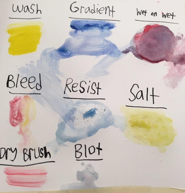
Practice techniques with watercolor.
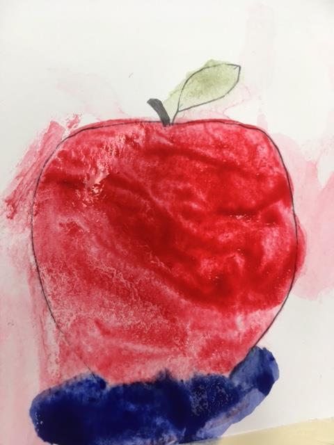
Apple for practice.
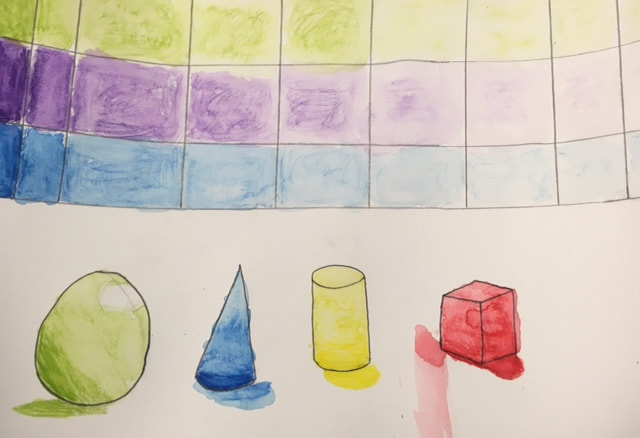
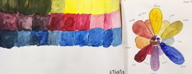
Practice with colors: I practiced contrast with cool colors. In the shapes below, I practiced contrast with cool and warm colors.
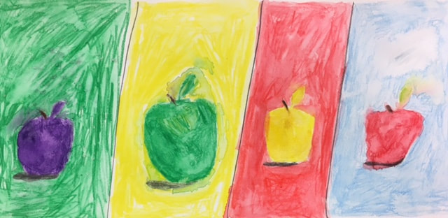
More watercolor apples for practice: I used watercolor pencil in all 4 apples. Green and purple (in the first apple) are the cool colors. The yellow apple (3rd) is a warm color against red which is another warm color, and I used wash to color the apple. In the purple apple, I used salt. The technique for the 4th apple was wet on wet.
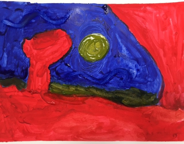
This is my original watercolor artwork. It's called "The Moon Over The Red Rocks." I got the idea from Georgia O'Keeffe.
W.I.P. (Watercolor and mass fluid project)
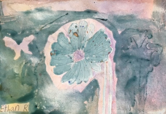
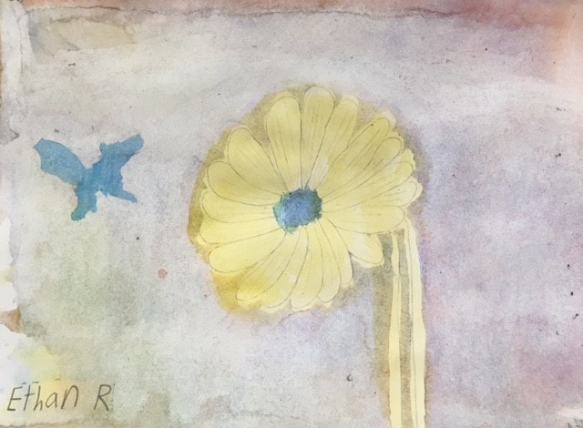
Final Artwork "Yellow Flower"
Self Evaluation
1. Explain the process you had to use to create the poured watercolor painting.
First, I sketched out the flower. Next, I painted the flower with mass fluid (a blue liquid), making it blue. Then I squirted colors from a bottle onto the white background and dried it with a hair dryer. Then I painted some of the background with mass fluid. I outlined a butterfly while doing that. Finally, I scraped off all the mass fluid, revealing my final piece. I painted the butterfly and center of the flower blue and the flower petals and stem yellow.
2. Describe any difficulties you had with this process.
I didn't really have too much trouble with this process. One area I do remember having difficulty with was the scraping part. I had to use a scraper to scrape the mass fluid off. It was so difficult because the scraper would come apart every time I worked too hard with it. I found that to be very frustrating.
3. What were 4 things you learned from this project?
I didn't know what mass fluid art was, so I learned that technique. I also learned how to use a scraper and how to remove mass fluid. I learned how to squirt paint from a bottle onto paper. The last thing I learned from this project was how to create a lovely background using a hair dryer for drying the wet colors.
4. What would you do differently if you were to do this project again?
If I were to do this differently, then I would have painted a beautiful picture of a canyon. I wanted to create art like Georgia O' Keeffe, but I wasn't aware of being able to do this at the time we did the project. I think mass fluid art would've been a great way to do landscapes.
5. How did you use layers, textures, and color to create a successful piece?
I layered several times with different colors. The squirting of the paint and drying with the hair dryer created a beautiful and colorful background. I painted the flower first blue then yellow. You can see the pencil outline from when I first sketched it.
6. Do you feel that the mini watercolor lessons were beneficial to you learning more about watercolor? Explain.
The watercolor apples and other practice with the shapes did help me with this unit. It helped me with different techniques when doing watercolor. I enjoyed watercolor pencil and wash the most. It is always fun to do many things within a unit.
7. Was having a guest artist a positive experience? Explain.
Yes. I enjoyed having the guest artist come in and teach us something interesting. I would've never learned about mass fluid if he never came.
8. What did you learn from the guest artist that gave you more insight into being a professional artist?
If you have an idea that is creative, be creative. It doesn't matter what everyone else thinks of your techniques. If it gives you pleasure to do art a certain way, then do it the way you want it. There is no wrong way to express yourself.
Colored Pencil Unit:
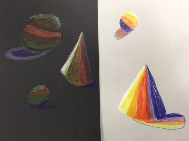
Shape practice with prismacolor pencils.
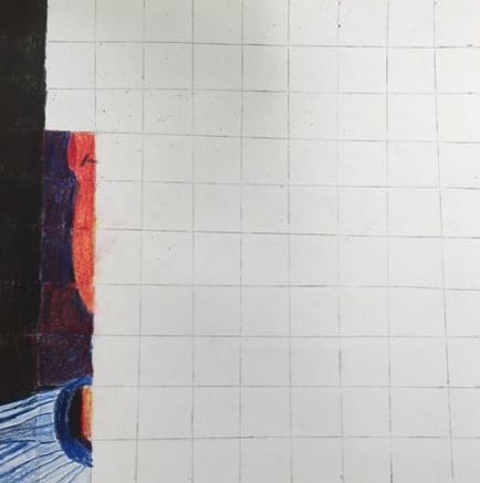
W.I.P #1 Starting left side of my face.
W.I.P #2 Adding more of my face.
W.I.P #3 Working on shading.
W.I.P #4 Added an ear.
W.I.P #5 Added more background.
W.I.P #6 Better shading.
W.I.P #7 Added even more background.
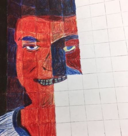
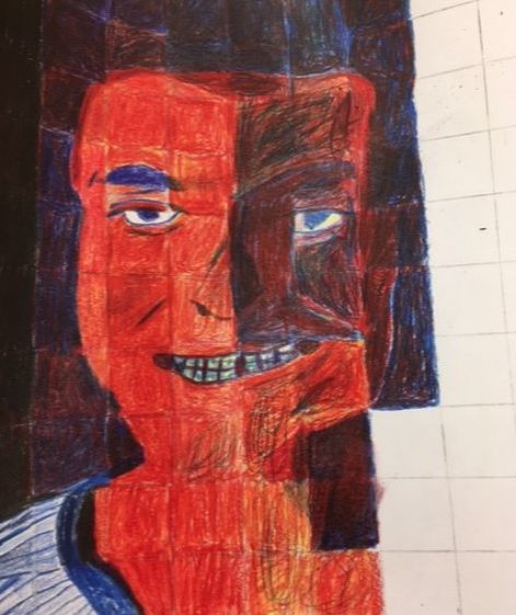
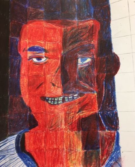
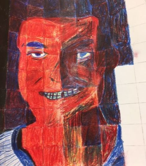
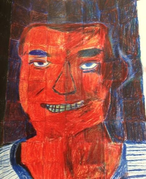
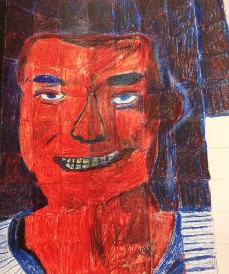
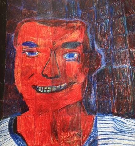
Final Artwork: "Face of Ethan Renfroe"
Self Evaluation
1. Describe the craftsmanship of your portrait. (Is it neat and well executed?)
Yes, I think the portrait is neat and pretty well done. The features on my face look good. I think my teeth and eyes in particular are nice. My shirt looks like my real shirt with the stripes. For my first time, I think the portrait came out well even though I turned out redder than I would have liked.
2. Describe any difficulties you had blending and mixing your colors.
I struggled with mixing the colors on my face. I wanted some shading, but I ended up looking a bit like a zombie especially on my neck. I ended up erasing and re-blending red and yellow. I didn't realize how hard it would be to blend colors.
3. Did you follow directions and draw each grid box separately? Why is this important?
Yes, I did follow directions and drew each grid box separately. I think it made my portrait look very accurate and realistic. It was also cool to see the progress of the work as I filled in the boxes. What a neat process.
4. How did you create value changes with your colored pencils?
First, I used my colored pencils to shade the side of my face. I used darker red to make the value change. My original photo had shading on one side of my face that I wanted to have in my self-portrait. Also, since I used white paper to begin with, I was able to make the blue stripes contrast the white to make another value change.
5. Discuss how you were able to get the color you wanted from the 3 pencils?
I used red, yellow and blue colored pencils. I used the red and yellow on my face and blended them to get the color I wanted with the shading. I used the blue on my eyebrows, the outlines, my hair and shirt. In the background, I used red, blue and yellow.
6. How could you improve your portrait?
I think I would have worked on my hair a bit better because it blends into the background so it gets cut off in the portrait. I am not sure that I like the darker color for my face so maybe I could have made it a little lighter. Also, I think I made my face wider than I would have liked.
7. Looking back do you feel you were prepared for this project? What part of the unit was beneficial in the success of the portrait?
I did have experience with the colored pencils before I started, so I do think I was somewhat prepared for this project. However, it was much harder to create a self-portrait using the colors red, yellow and blue. Using the grid method made it easier for me to get through this project.
8. Choose another classmate’s piece that you feel is an excellent example of mastering the techniques. Discuss why you feel this way.
I picked Marlena's self-portrait from the digital portfolios as an excellent example of the techniques. Her portrait looks very realistic. Her eyebrows, eyes and mouth have so much detail. The color blending is fantastic as well. It is hard to tell that she even used red and yellow. It gives me an idea of how to improve my own work if I were to do another self-portrait.
Food Sculpture Unit:
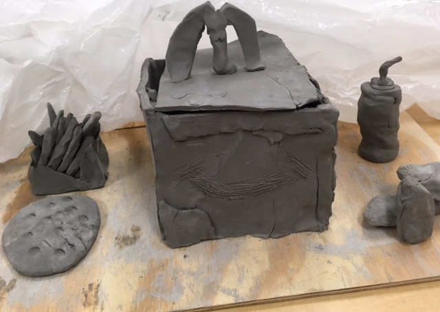
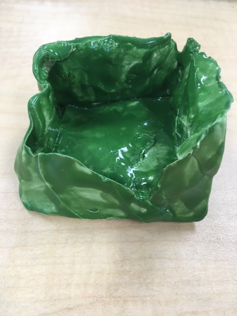
W.I.P. Here is a front view of my clay box meal with my favorite foods - chicken nuggets, french fries, chocolate milk and a chocolate chip cookie.
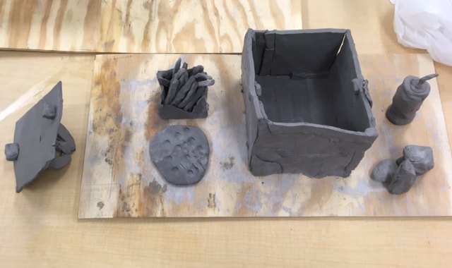
W.I.P. 2 Top down view of the clay box meal and food.
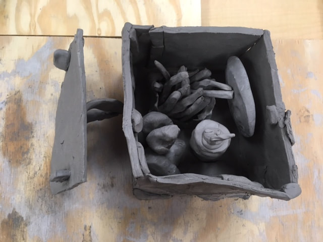
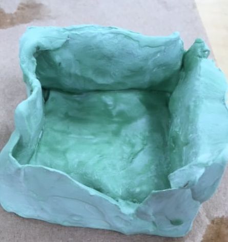
W.I.P. 3 Food in clay meal box.
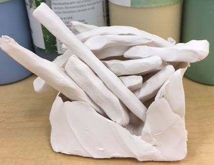
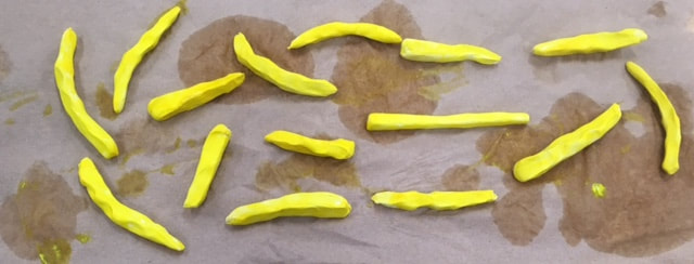
Back from the kiln, before painting, with french fries.
Painted french fry box. French fries to be painted later.
The french fries are now painted.
The painted meal box.
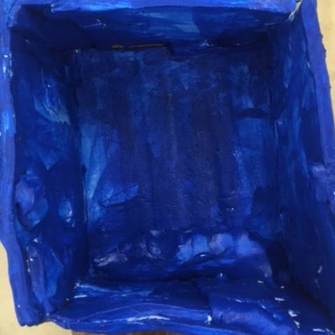
Inside of the painted meal box.
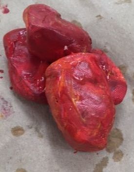
The chicken nuggets are now painted.
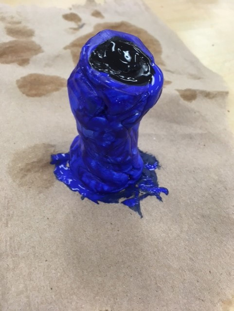
The milk bottle (no straw) is now painted.
The french fry box is now glazed.
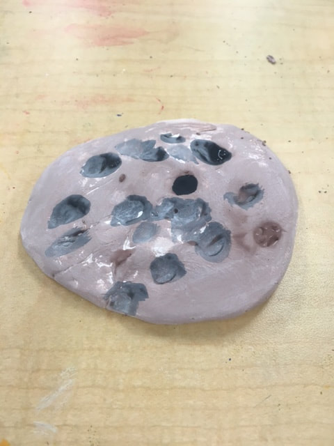
The cookie is now painted.
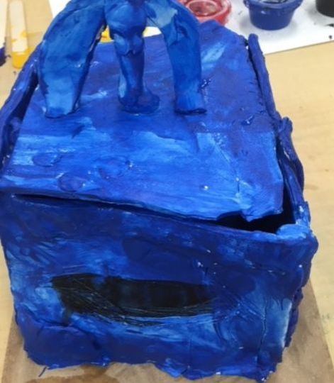
Final Sculpture: "The McEthan Meal"
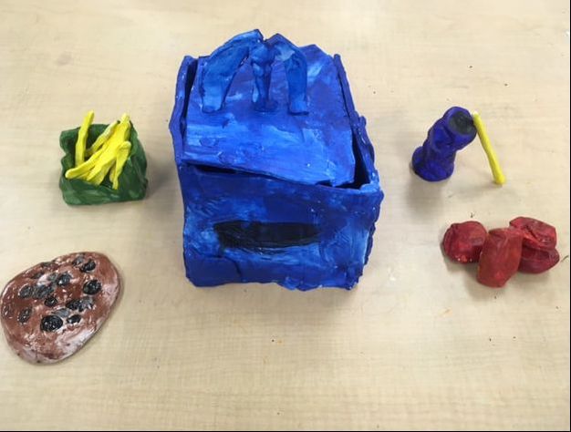
All the foods together (Post glazing). Front view.
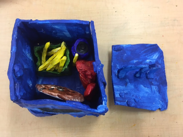
Top down view with foods inside.
Self Evaluation
1. Describe the craftsmanship of your sculpture. (Is it neat and well executed?)
I am happy with the craftsmanship of my food in a meal box. I think I did a nice job of using clay to re-create food. Once the pieces were fired and glazed, I had some issues, but overall I am pleased.
2. What was the most difficult part of this project?
The most difficult part of my project was coming up with an idea that would be a good subject for this project. I am a picky eater, so my experience with food is limited. Also, I wanted to be original from other pop art sculptures without infringing on copyright law.
3. Did your color choices work together harmoniously?
Yes. Each part of my meal is a distinct color. The chicken nuggets are brownish similar to the cookie. The rest of the items are blue based. The colors look nice together.
4. Is your sculpture interesting from all views?
The McEthan meal box is interesting from all of the views. You can see all of the items displayed out of the box and all of the items displayed inside the box. I am especially proud of the french fry sculpture with the 3D box and 3D french fries.
5. Describe the differences in constructing a sculpture and doing something 2D.
When I make a sculpture, it is 3D, besides drawing something which is 2D. For example, when I made my meal box, I had to build it with multiple slabs of clay. Also, making the chicken nuggets and french fries, I shaped them to create a 3D effect. I rolled the clay to give the milk box the 3D shape as well.
6. How did you create textures in your sculpture?
I didn't really use a lot of texture in my sculptures. The only examples are when I pushed into the clay to make chocolate chips for my cookie and made the milk box have a squished effect. However, I did manipulate the clay with my fingers to make the food look real.
7. Does your sculpture look like the actual food? How did you accomplish this?
Yes. I think it does. My intention was to re-create a standard restaurant meal box. The chicken nuggets, the french fries, the drink, and cookie looked like what you would see in a restaurant. I used clay manipulation with some texture to make the food look realistic.
8. What would you do differently if you were to do this project again?
There are a couple of things I would've done differently. First, I would have made the milk box less likely to lose it's straw since it fell off when it went to the kiln. Also, I would've come up with a more original topper to the lid of the meal box though it is a McEthan meal with no copyright infringement intended.
Painting Unit:
Practice with paint.
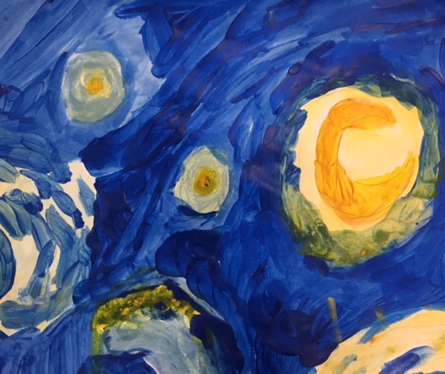
Re-creation of part of Vincent Van Gogh's "Starry Night."
Sketch 1 idea for Horace Pippin styled painting.
Sketch 2 idea for Horace Pippin styled painting.
Colorized version of sketch 1.
Colorized version of sketch 2.
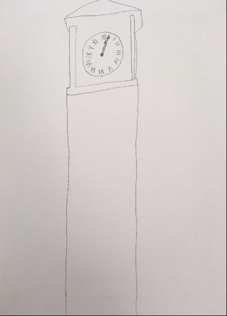
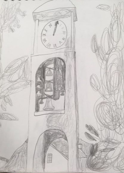
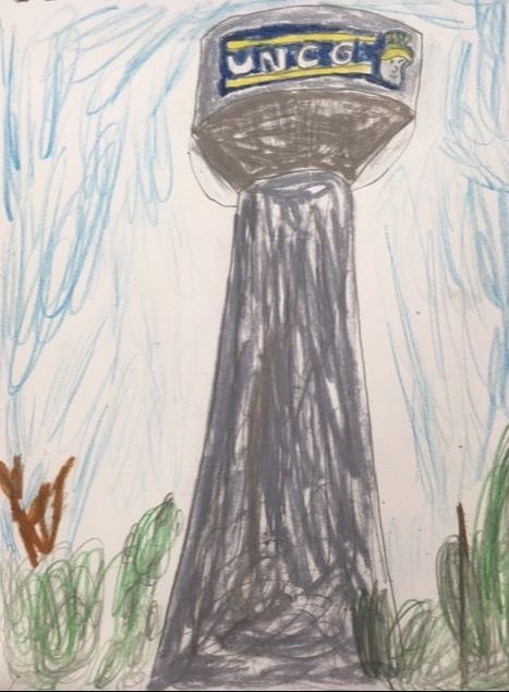
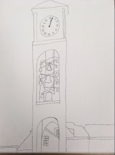
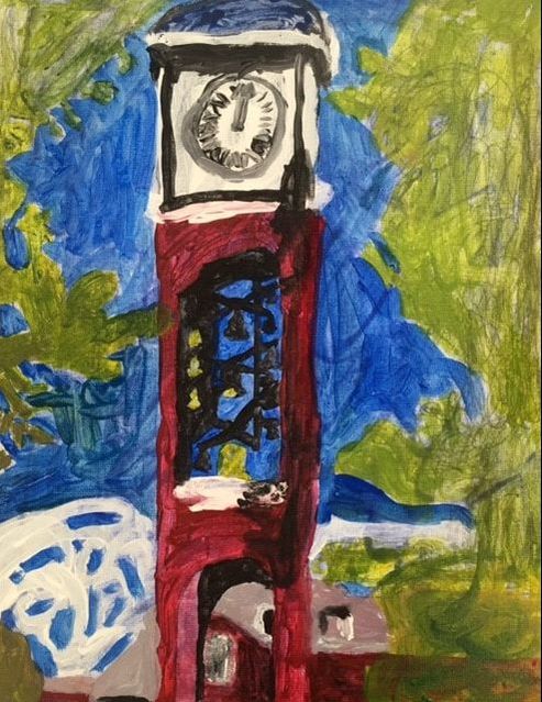
Decided on clock tower for Horace Pippin styled painting. Started sketching.
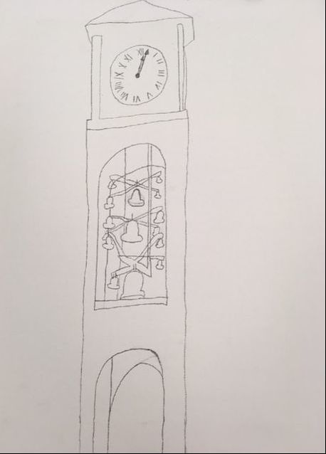
More detailed sketching.
Added even more detail.
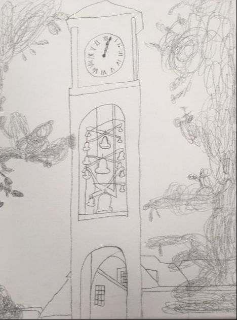
Included landscape.
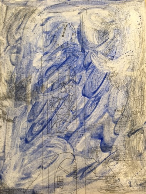
Started with background paint.
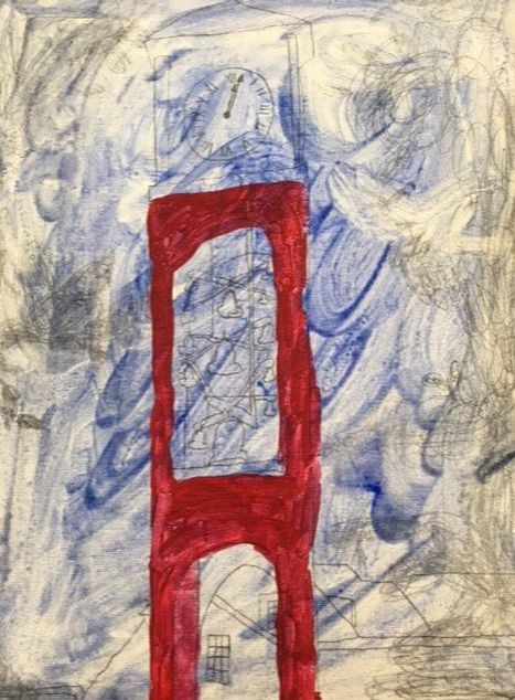
Added color to the clock tower.
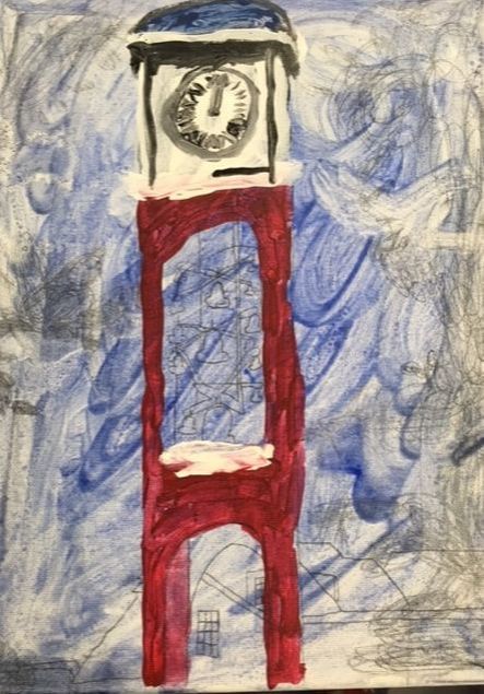
Painted the top of the clock tower.
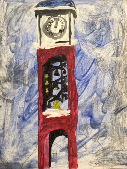
Painted the inside of the clock tower.
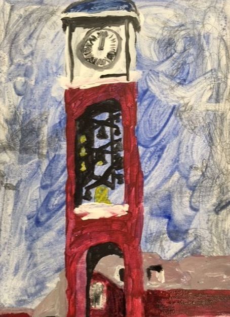
Painted the buildings in the background.
Painted some of the trees.
Painted the rest of the trees.
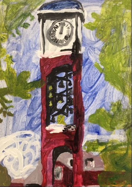
Added clouds and shadowing.
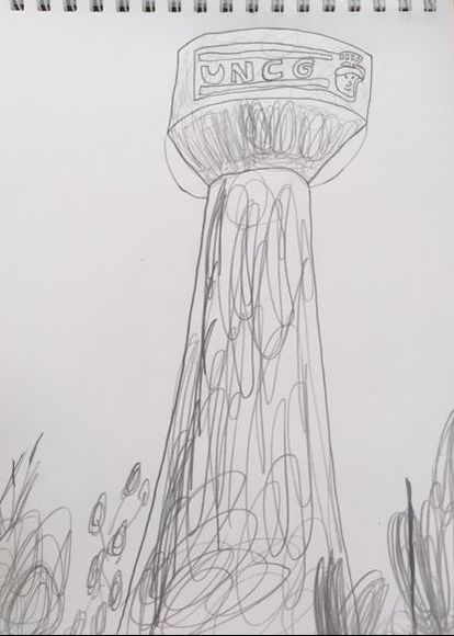
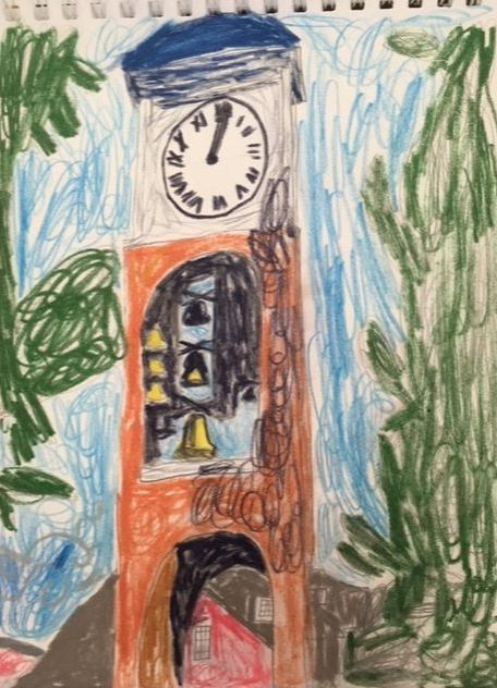
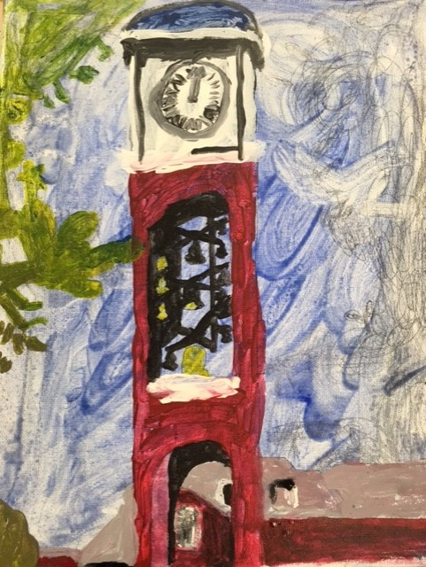
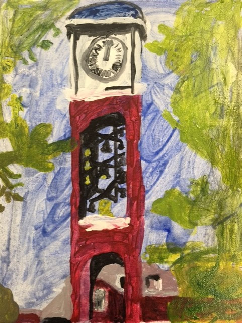
Final Artwork: "UNCG Clock Tower" (In the style of Horace Pippin)
Self Evaluation
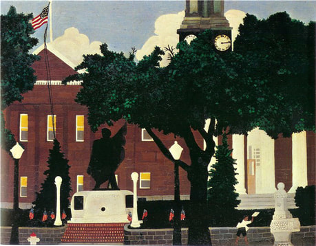
1. Who was your referenced artist for the painting? Name 4 main ideas you used from your research to create your painting.
Name- Horace Pippin
1. Very cartoon like in appearance
2. Historical in subject
3. Bright colors in the piece
4. Informal training in look
2. Describe the craftsmanship of your painting. (Is it neat and well executed?)
I think my work is a little more abstract that I wanted it to be. Pippin seemed to paint with crisper detail. Using acrylic paint, I had a hard time with the details. However, the clock tower bells came out pretty well.
3. What was the most difficult part of this project?
Making a painting in the style of another artist is very difficult. Although I tried to make my painting look like Horace Pippin's, I couldn't replicate his style exactly. He has really sharp details in his work maybe because he used oil paint instead of acrylic. It looks like his work was drawn with pens instead of painted.
4. Describe your color choices and how they reflect the work of your chosen artist?
I used very bright colors just like Horace Pippin. I used green for the trees and a nice red for the historic clock tower with part of a building the background. I think I went with the colors he would've chosen.
5. Describe how the style of your landscape reflects your chosen artist.
Pippin used historic buildings with landscapes. I chose the UNCG clock tower with landscape to represent something Pippin would've done. Pippin used a lot of green trees in his art which I used too.
6. What do you think your chosen artist would say if he or she could see your painting today?
Pippin would say that I tried hard. He would also say that it would've been something he would've painted. He would be pleased that I like history as much as he did.
7. What would you do differently if you were to do this project again?
I would have used a different way to make the images pop out like he did. Using acrylic paint, it would leak and not create as clear images as I would've liked. His work looks like someone took a photo and drew with a pen, and that is what makes it special. My work turned out a little too abstract.
